Main Navigation Style
The main navigation style is available only for desktop and tablet layouts. Being responsive, the main navigation adjusts to desktop, tablet and mobile with 3 different layouts. The tablet layout for the main navigation stacks the logo and the main navigation on top of each other. The mobile layout for the main navigation uses Bootstrap's collapsing navbar and has both a light and a dark version.
How to set up the main navigation
1. Use the nav module position
Assign your main navigation menu module to the NAV module position which is a special module position designed to be used only for the main navigation:

2. The main navigation on mobile devices
Being responsive, the main navigation adjusts to desktop, tablet and mobile with 3 different layouts. The tablet layout for the main navigation usually stacks the logo and main navigation on top of each other. The mobile layout for the main navigation uses Bootstrap's collapsing navbar and has both a dark and a light version:

If you want the parent mobile menu elements to be collapsible, the parent menus (ex: the "Features" menu, in our demo) should be menu type "Menu heading" or "External URL" with "#" configured as the URL. Otherwise, if you parent menus have actual active URLs assigned to them (internal or external), the URL will be triggered before the menu can have the chance to collapse.
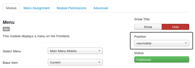
3. Using a mobile menu that's different from the main menu
By default, the mobile menu uses the same content as the main menu on desktop. Since the desktop menu has usually a much more complex content structure than what the mobile navigation can handle, having the option to use two different menus for mobile and desktop can be really helpful.
This is why we created the navmobile module position, which can be used to create a separate menu module that will be active only on mobile and will have its own menu content, different from the one on desktop.
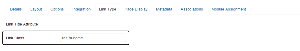
nav module position and the mobile navigation will include by default the same menu content as the one for desktop.How to add icons to the main navigation items
Choose any icon from Font Awesome and insert the name of the icon into the LINK CSS STYLE field in the LINK TYPE tab of the menu item. If you do not want to use any icon for the main navigation item, then simply leave this field blank:
© 2026 Santa Lucía Golf Club